In the ever-evolving landscape of web development, the need for scalable and maintainable design systems has become paramount. Enter Atomic Design, a methodology that breaks down user interfaces into smaller, reusable components. When coupled with React, a JavaScript library for building user interfaces, Atomic Design becomes a powerhouse for creating flexible and efficient UIs.
Why Atomic Design.
Atomic design promotes a structured and systematic approach to building design systems, resulting in more consistent, scalable, and efficient products.
Understanding Atomic Design
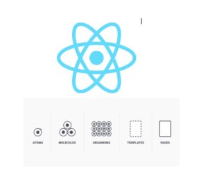
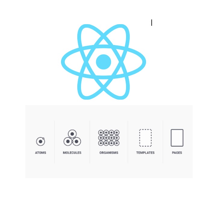
Atomic Design, coined by Brad Frost, is a methodology that views UIs as a composition of smaller, atomic elements. These elements are categorized into five distinct levels:
1.Atoms: The basic building blocks of a UI, such as buttons, input fields, and labels.
2.Molecules: Combinations of atoms that form more complex components, like a form field consisting of a label, input, and button.
3.Organisms: Groups of molecules working together to fulfill a specific function, such as a navigation bar or a search form.
4.Templates: Higher-level structures that define the layout and arrangement of organisms on a page.
5.Pages: Instances where templates are populated with real content, resulting in actual user interfaces.
This hierarchical structure allows for better organization, reusability, and scalability of UI components.
Integrating Atomic Design with React
React’s component-based architecture aligns seamlessly with Atomic Design principles. Each level of the Atomic Design hierarchy maps neatly to React components:
- Atoms can be represented by simple React components that encapsulate basic UI elements.
- Molecules are composed of multiple atom components, creating more complex UI elements.
- Organisms consist of groups of molecules and atoms, representing self-contained UI sections.
- Templates are essentially React components that define the layout structure, rendering organisms in a specific arrangement.
- Pages correspond to React components that serve as the entry points to the application, rendering templates with real content.
Implementation
Let’s dive into a practical example to demonstrate how Atomic Design can be implemented in React.
1.Atoms:
- Create separate React components for each atomic element (button, input, etc.).
- Style these components using CSS-in-JS solutions like Styled Components or Emotion, or with a CSS framework like Bootstrap.
// Atom - Button.js

import React from 'react';

const Button = ({ onClick, children }) => {
  return (
    <button onClick={onClick}>
      {children}
    </button>
  );
};

export default Button;
2.Molecules:
- Create React components that combine atomic elements.
- Pass props to configure the behavior and appearance of molecules.
// Molecule - LoginForm.js

import React, { useState } from 'react';
import Button from './Button';

const LoginForm = () => {
  const [username, setUsername] = useState('');
  const [password, setPassword] = useState('');

  const handleLogin = () => {
    // Logic for handling login
  };

  return (
    <form>
      <input
        type="text"
        placeholder="Username"
        value={username}
        onChange={(e) => setUsername(e.target.value)}
      />
      <input
        type="password"
        placeholder="Password"
        value={password}
        onChange={(e) => setPassword(e.target.value)}
      />
      <Button onClick={handleLogin}>Login</Button>
    </form>
  );
};

export default LoginForm;
3. Organisms:
- Develop React components that encompass multiple molecules or atoms.
- Focus on the internal layout and functionality of the organism.
// Organism - Header.js

import React from 'react';
import Button from './Button';

const Header = () => {
  return (
    <header>
      <h1>My App</h1>
      <nav>
        <ul>
          <li><Button>Home</Button></li>
          <li><Button>About</Button></li>
          <li><Button>Contact</Button></li>
        </ul>
      </nav>
    </header>
  );
};

export default Header;
4.Templates:
- Create React components that define the overall layout structure.
- Use CSS Grid or Flexbox for flexible layout management.
// Template - DefaultLayout.js

import React from 'react';
import Header from './Header';

const DefaultLayout = ({ children }) => {
  return (
    <div>
      <Header />
      <main>{children}</main>
      <footer>© 2024 My App</footer>
    </div>
  );
};

export default DefaultLayout;
5.Pages
- Combine templates and organisms to create the final UI screens.
// Page - HomePage.js

import React from 'react';
import DefaultLayout from './DefaultLayout';

const HomePage = () => {
  return (
    <DefaultLayout>
      <h2>Welcome to My App</h2>
      {/* Additional content goes here */}
    </DefaultLayout>
  );
};

export default HomePage;
Component Structure and Naming Conventions
- Organize your components using a folder structure that reflects the Atomic Design hierarchy (atoms, molecules, organisms, templates, pages).
- Employ consistent naming conventions to improve code readability (e.g., prefix atoms with Atom, molecules with Molecule, etc.).
Conclusion
By leveraging the principles of Atomic Design in conjunction with React, developers can create modular, maintainable, and scalable UI components. This approach not only streamlines the development process but also fosters consistency and reusability across projects. As you embark on your next React project, consider adopting Atomic Design principles to unlock the full potential of your UI development workflow.
Enjoy Coding!